Monitoring Desk
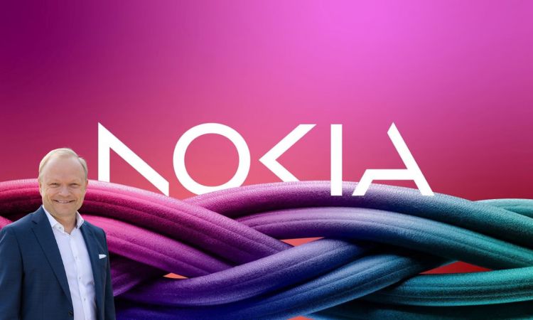
ESPOO, FINLAND: For the first time in almost 60 years, Nokia has changed its iconic logo, as the telecom equipment maker increases focus on aggressive growth.
The new logo is comprised of five different shapes forming the word NOKIA. Meanwhile, the iconic blue color of the old logo has been replaced with a range of colours depending on the use.
“There was the association to smartphones and presently we are a business technology company,” Nokia’s Chief Executive Pekka Lundmark told Reuters in an interview.
Lundmark was speaking prior to a business update by the tech firm on the eve of the annual Mobile World Congress (MWC) which will kick off in Barcelona on Monday and continue till March 2.
Lundmark’s bid to uplift Nokia
After taking over the top position at the struggling Finnish company in 2020, Lundmark formulated a plan with three stages: reset, accelerate and scale. After the completion of the reset stage, Lundmark said the second stage is now beginning.
While Nokia still aims to further its service provider business, where it provides equipment to telecom companies, it is now mainly focused on selling gear to other businesses.


